
The game Pastiche is inspired by the famous works of master painters, and by a love for color.
The following information is provided for educational purposes and to enhance an appreciation of some the concepts underlying the mixing of colors in the game, but it is not essential to know for playing the game.
The word pastiche is used in the fields of literature and art to refer to something that is an imitation or recreation of an earlier work, often as a respectful homage or tribute to the original. In this game, players are making pastiches by mixing colors and recreating some of the palette colors used to create the original paintings of the masters.
The color wheel - sometimes called a color circle - is a commonly used system for organizing colors in a circular shape, in order to show the relationship between colors. Used by artists, designers, and scientists, it helps understand the use of color.
The basic color theory behind the color wheel - such as the concepts of warm and cool colors, and of complementary colors - can have useful application in the fields of art and design.
The origin of the color wheel is usually credited to the color circle designed by Sir Isaac Newton in 1666. Since that time scientists and artists have proposed various models of color theory, some based on the spectrum of light, others based on mixing paint pigments. For Pastiche, we've created our own version of the color wheel.
The Pastiche Version Of The Color Wheel
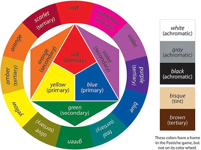
Most color wheels used by artists consist of 12 main divisions:
Primary colors: (red, yellow and blue) are the basic colors from which all other colors are mixed.
Secondary colors: (green, orange, and violet) are created by mixing the primary colors.
Tertiary colors: (red-orange, red-violet, yellow-orange, yellow-green, blue-violet and blue-green) are created by mixing primary and secondary colors.
Traditional color theory used in art and design, especially painting, employs the RYB color model just described. This uses red, yellow, and blue as the primary colors, which are the three colors that painters have long used in their palettes for creating other colors.
Other color wheels are commonly used for representing other color models. The RGB color model applies these principles to light, and uses red, green and blue as primary colors to create a spectrum of colors.
Modern scientific color theory as applied to the world of print employs the CMYK color model, which uses cyan, magenta, and yellow as the three primary colors (along with key = black) needed for mixing and creating the full range of colors with ink.
Do red and blue make purple, indigo, or violet?
There is ongoing debate about color naming conventions. This is partly the result of different models of color mixing, which take into account that light, ink, and pigments mix differently. Additive color theory is based on mixing actual light (e.g. rainbows and prisms), while subtractive color theory is based on mixing paint pigments and ink.
The results of color mixing will vary, depending on the nature of what is being mixed. For example, combining red and green light will produce a very different result than combining red and green paint. In other words, color is not the simple subject that it might appear to be. This is not helped by the fact that our everyday vocabulary of color names is by no means adequate or standard.
In common English usage the colors violet and purple are often used interchangeably, although according to a strict definition of these names this is not entirely correct. Purple is also frequently used as a blanket term to describe any hue of color between blue and red.
In the game Pastiche, the secondary color created by mixing blue and red is called violet, in keeping with the majority of color wheels used by painters and artists.
In the world of art, purple is often considered to be somewhere between violet and red on the color wheel, while indigo is considered to be between violet and blue. In the game the tertiary color created by mixing violet and blue has been named purple, reflecting a more general usage of the word and one color commonly associated with this name. No standard convention exists for naming tertiary colors, so the names used for these colors in Pastiche are not to be considered authoritative.
What about brown?
Brown is not technically a secondary color in the color wheel, but is considered a secondary color for the purposes of the game design. In real life it can be made by mixing red with green (which in turn is created by mixing blue and yellow), so the game does accurately reflect the fact that brown can be created using a mixture of all three primary colors.
Basic color theory holds that colors affect us in various ways emotionally and psychologically, and that a color scheme can set a mood or atmosphere.The color wheel has proven to be a useful tool for assisting in combining and selecting colors for this purpose.
It is often used to distinguish between warm colors (red through orange through yellow) which are vivid and energetic, and cool colors (green through blue through purple) which are calm and soothing, while white, black, and gray are considered neutral.
Colors that are opposite on the color wheel are considered complementary colors, while three colors that are adjacent on the color wheel are considered analogous colors. These concepts are used by artists to create different effects in their paintings.
Continue Reading


